Project Goals
Client:
Agency:


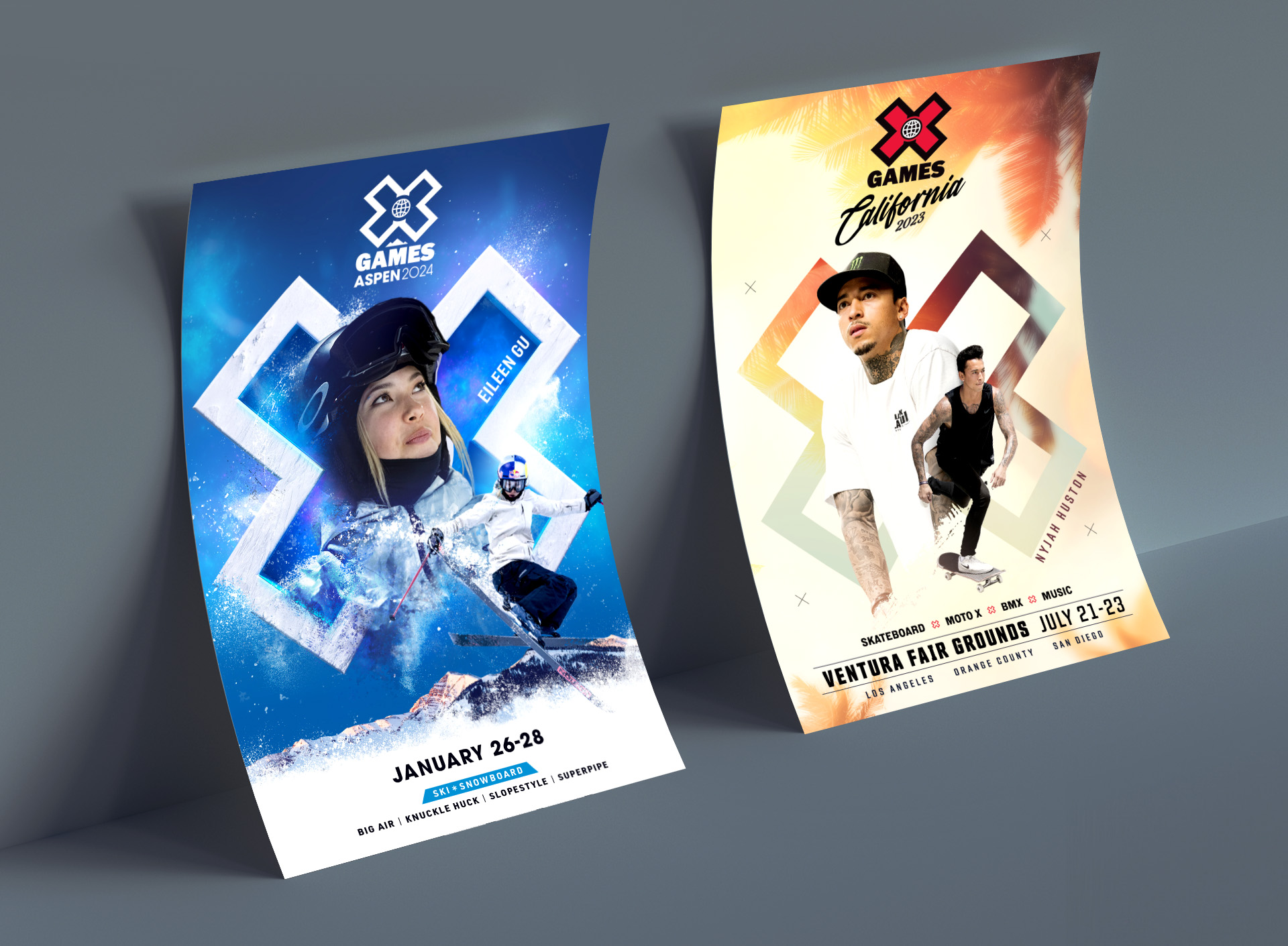
XGames Winter
Style guide
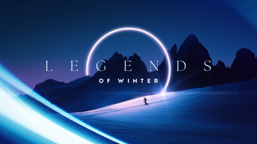
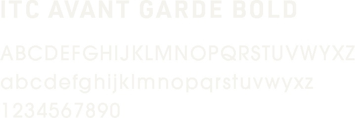
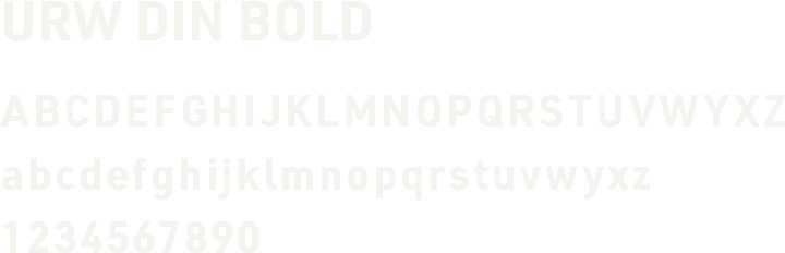
A winter-inspired color palette and bold typography system completed the campaign’s design.
#000000
#008CCF
#D5E0F1
#FFFFFF
Logo design
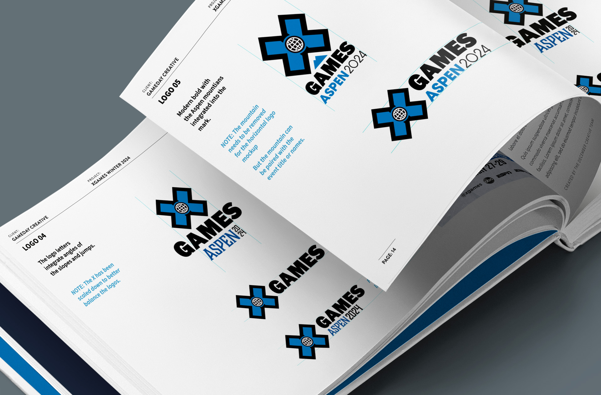
To tie the XGames brand to the venue, a graphic representation of the Maroon Bells mountain peaks was created. A range of logo explorations was presented to the client, showcasing various design directions.
Overarching campaign
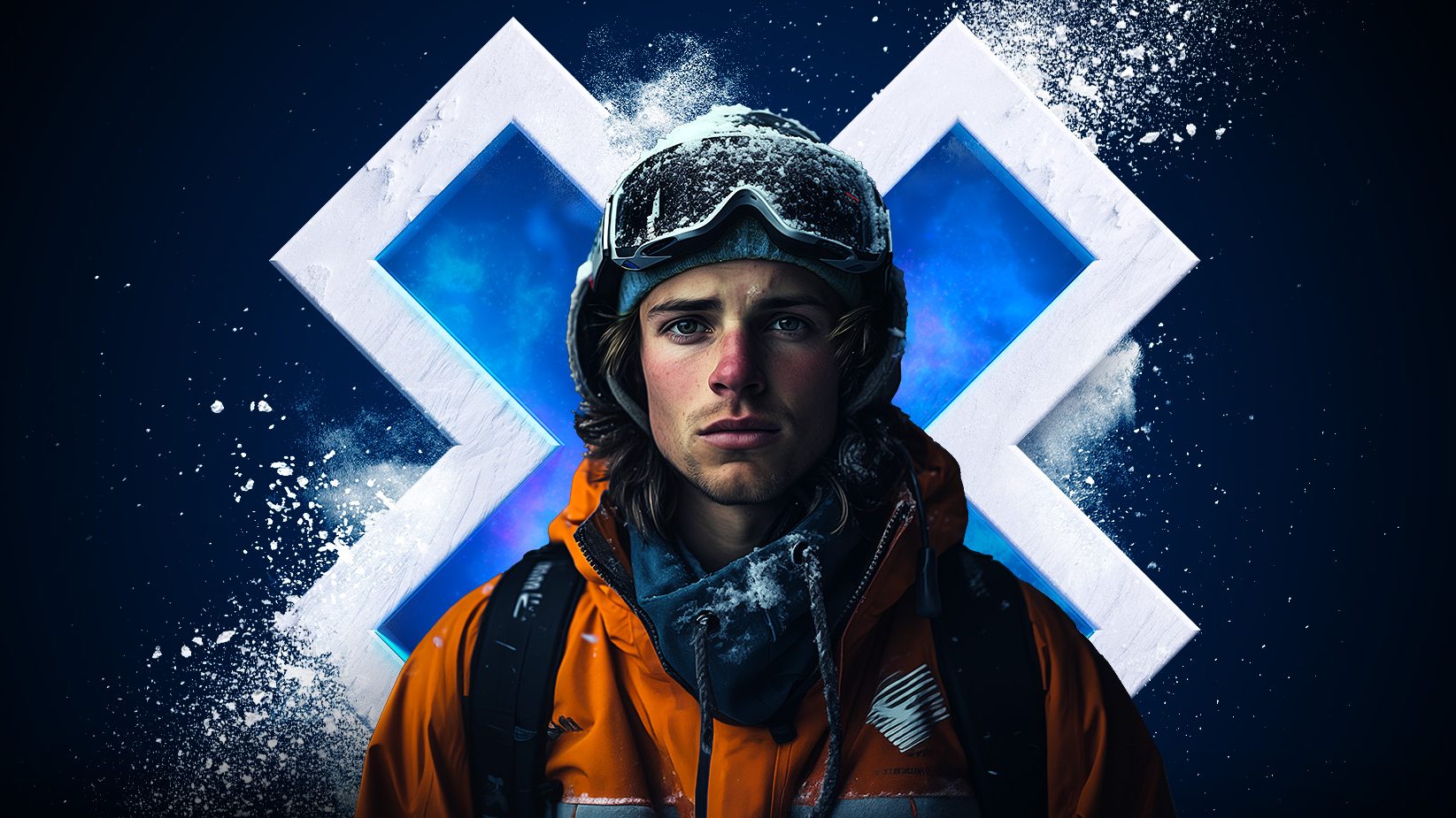
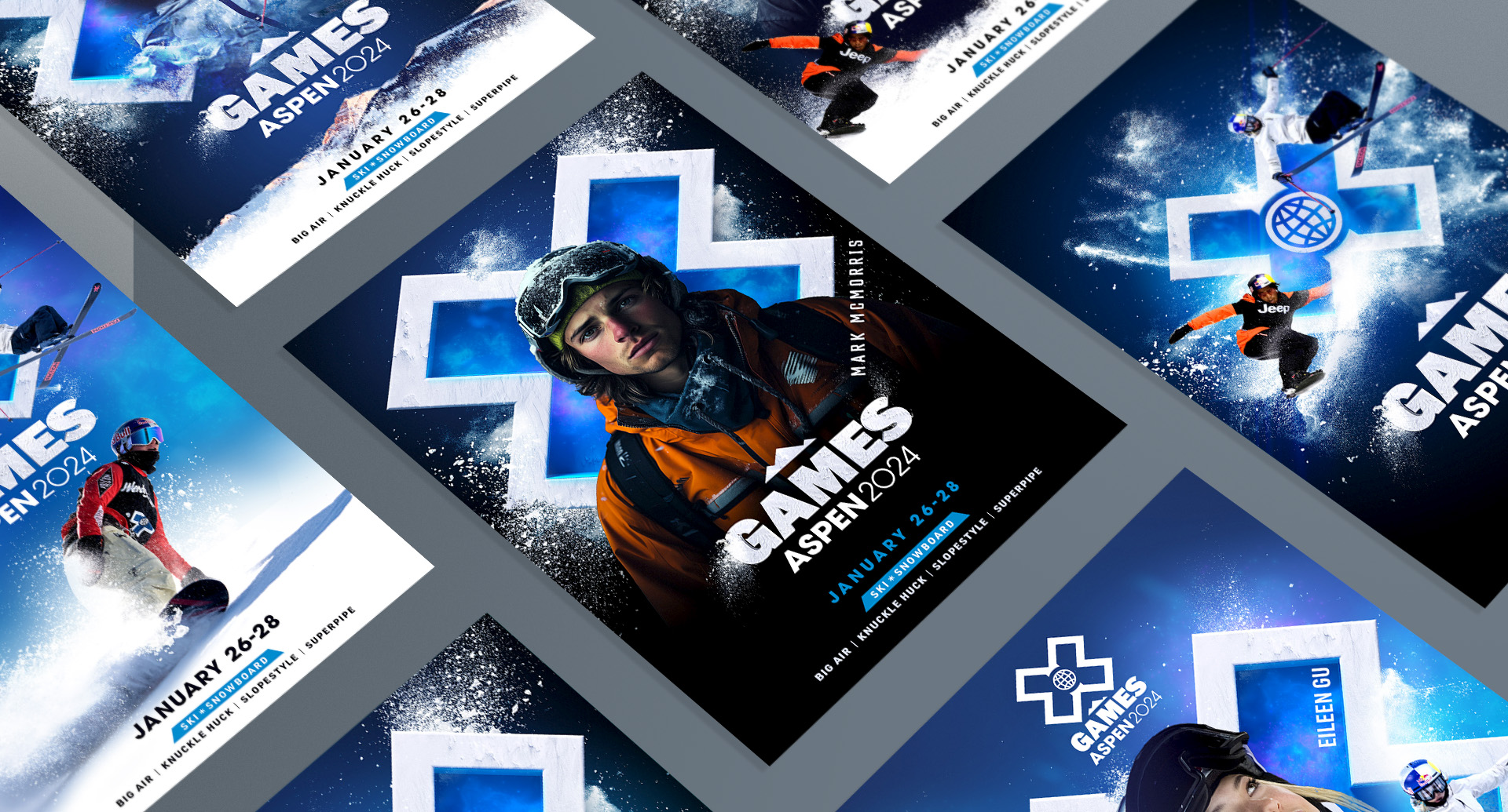
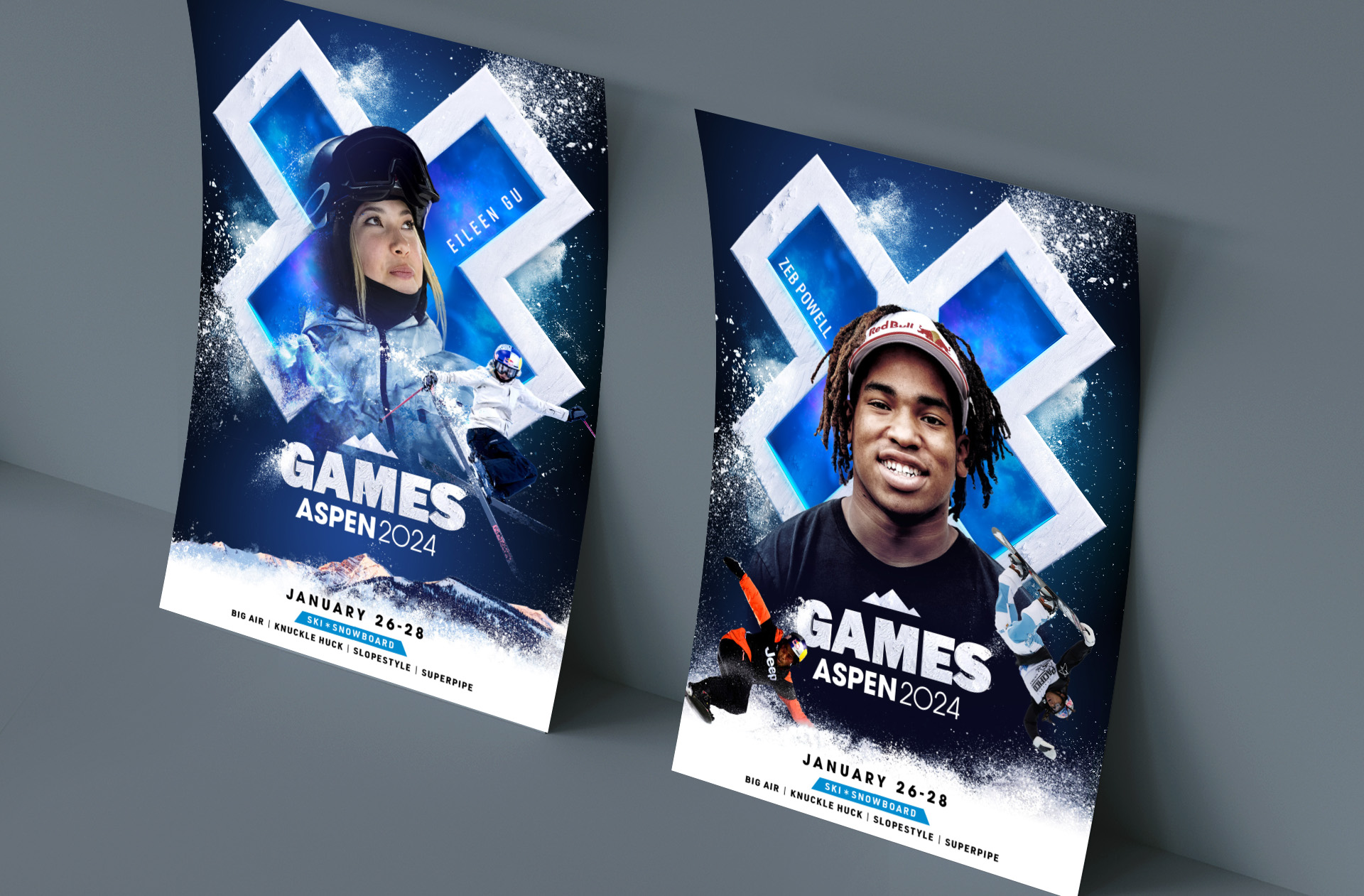
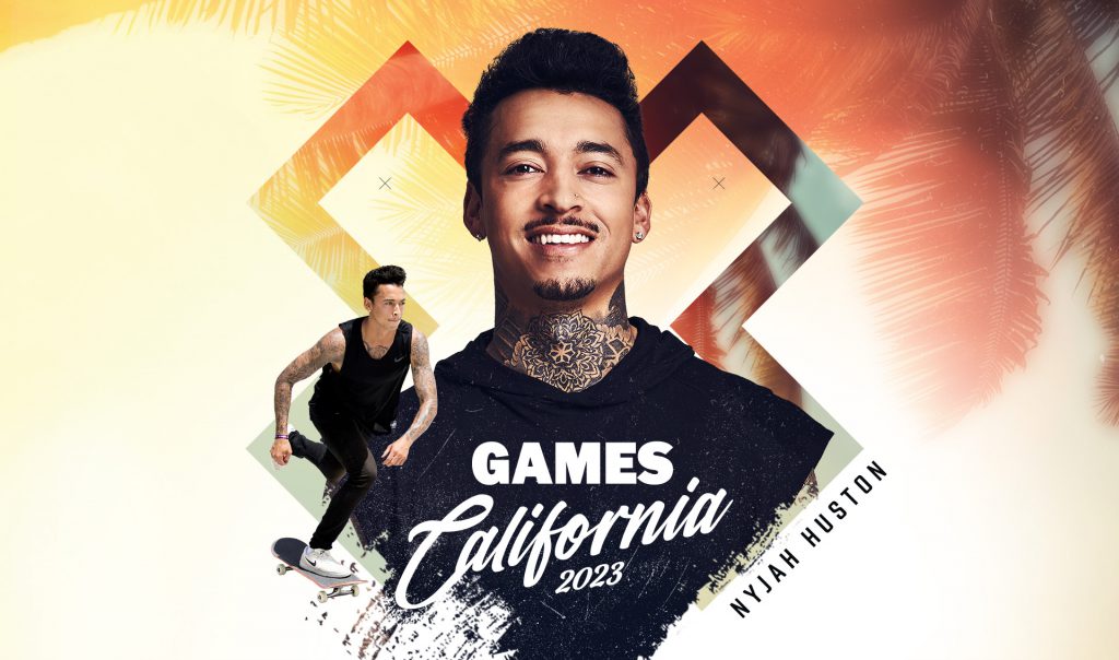
The design was anchored by the exploding X, with athletes bursting outward to capture the energy and excitement of the competition.


Games Summer
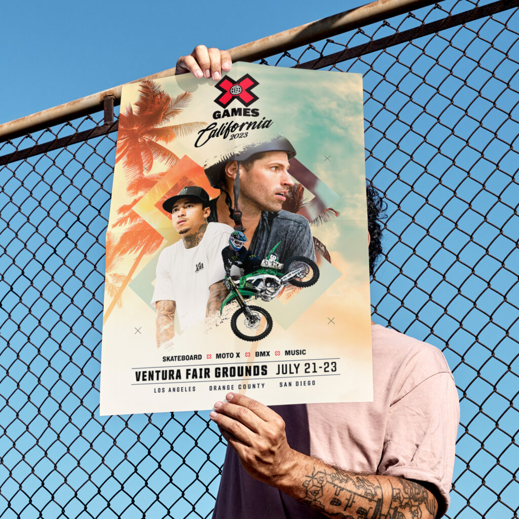
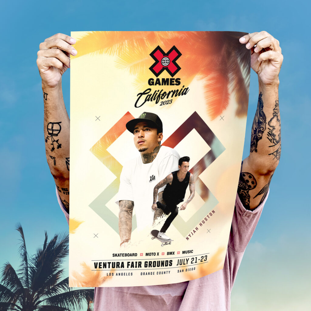

Style guide
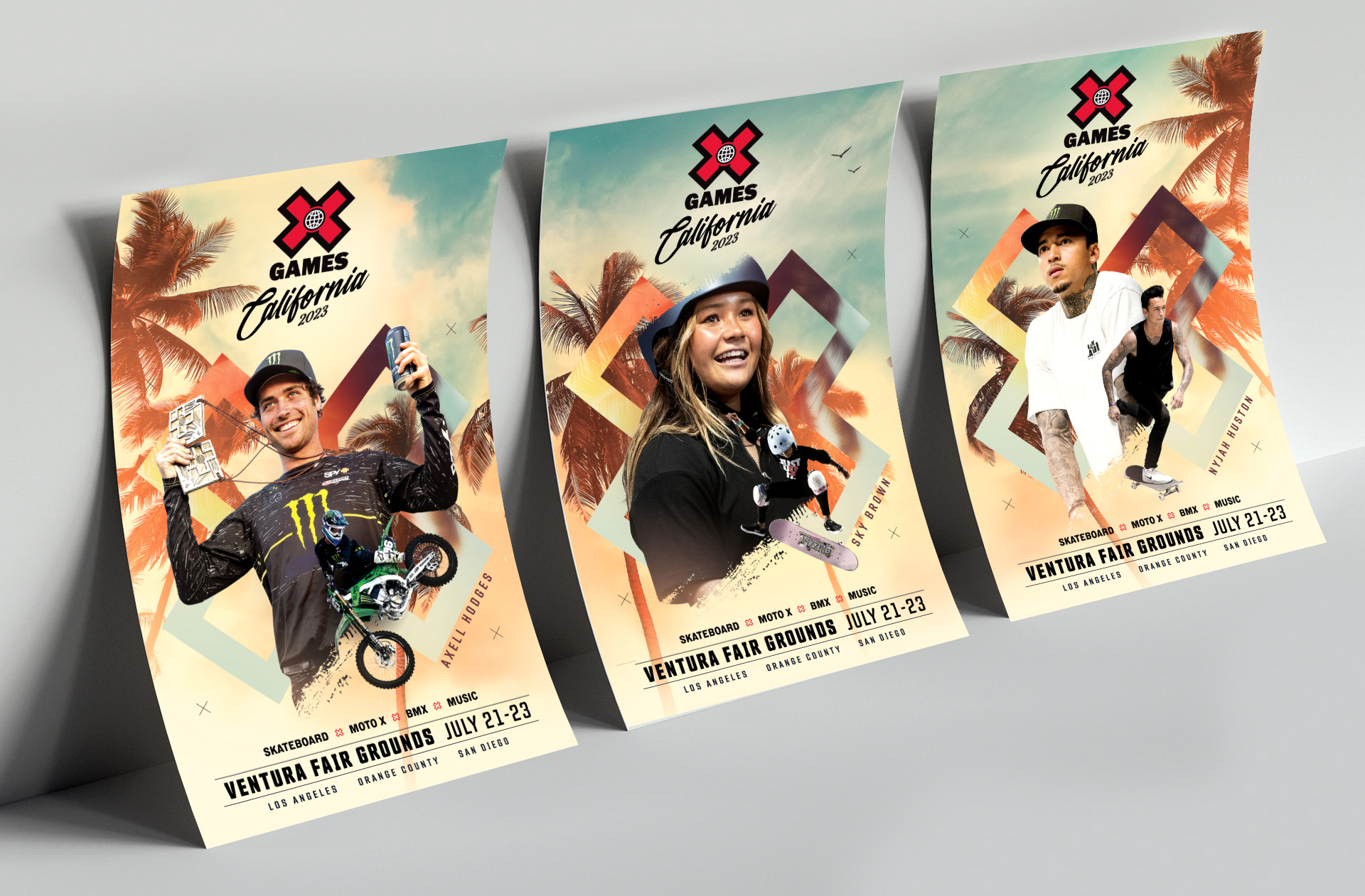
A California-inspired color scheme was paired with the signature XGames red, tying the entire campaign together. For typography, a modern condensed sans-serif font was chosen to contrast with the retro-inspired logo.
#000000
#1FB3BD
#F7985B
#FEf5E4


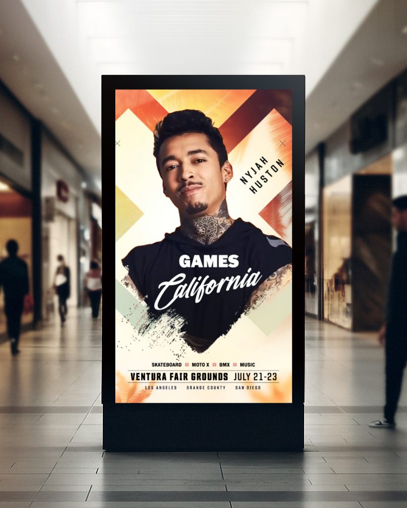
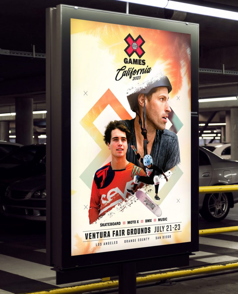
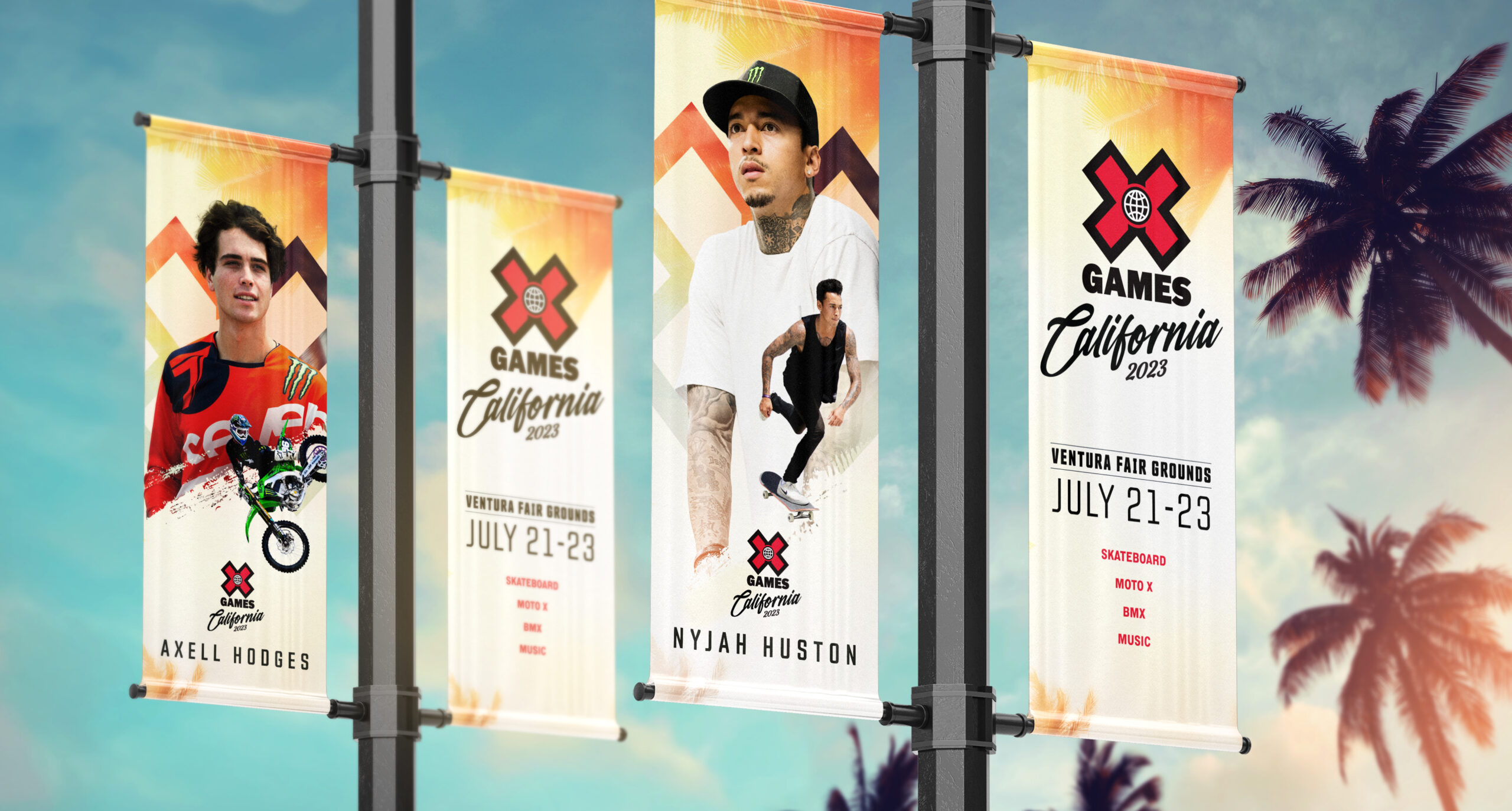
Athlete Poster Design
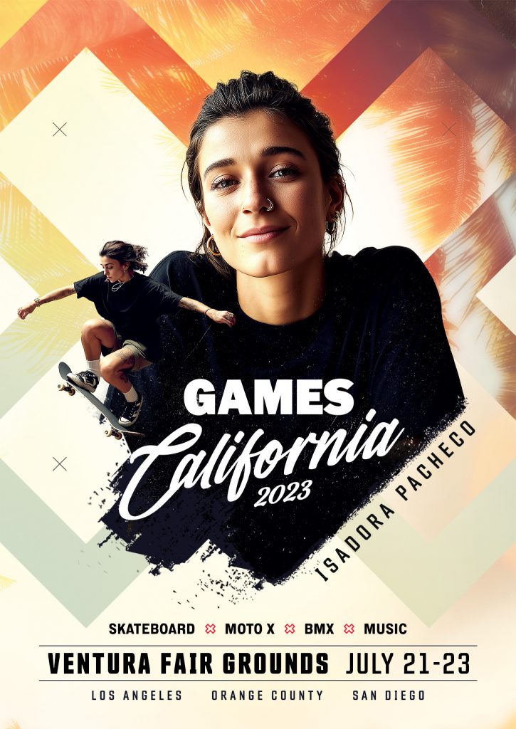
Inspired by the hero poster, each athlete was individually highlighted in a series of wild postings and social posts. Static portraits were contrasted with dynamic action shots, all framed by the signature XGames “X” for a bold, high-energy look.