Showtime
Sports
Concept + Design
Showtime Championship Boxing open and promo concept designs
Overview
Over the past few years, Joseph Kiely has developed a diverse array of creative concepts and promotional designs for Showtime Championship Boxing. His work spans everything from conceptual show opens to shoot-style boards and fully designed promo packages.
CLIENT:
AGENCY:

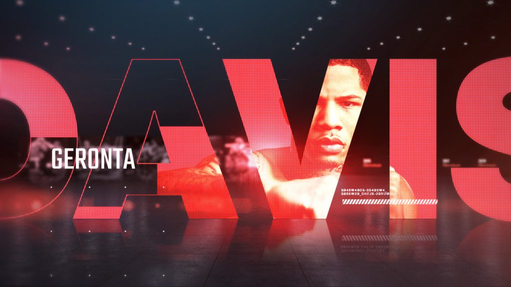
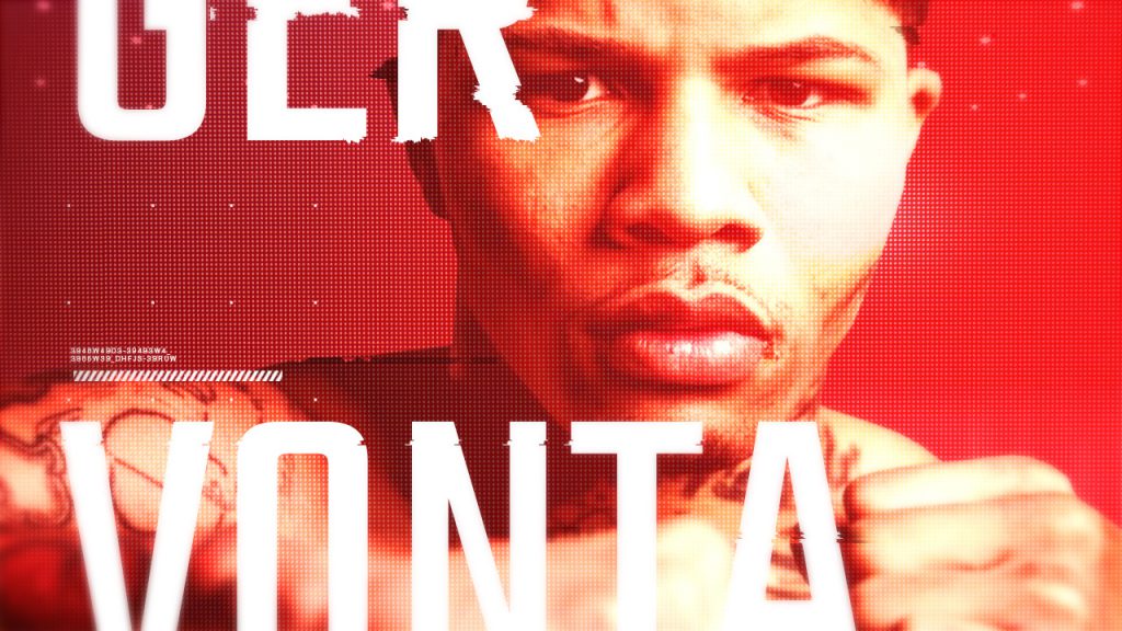
Show Open Concept
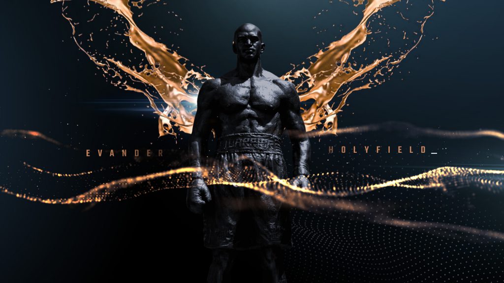
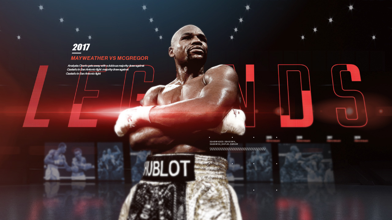
Showtime Championship Boxing has long been the proving ground for boxing legends—icons who define the sport and inspire the next generation. This legacy is honored through a striking visual concept: a pantheon of boxing gods, sculpted from black stone.
Ethereal gold weaves through these frozen figures, symbolizing their enduring impact. With each powerful punch, the stone exterior shatters, revealing a molten gold core. As the gold swirls through the scene, it reflects classic boxing moments before seamlessly coalescing into the Showtime Championship Boxing logo.
Concept + Design


Shoot concept
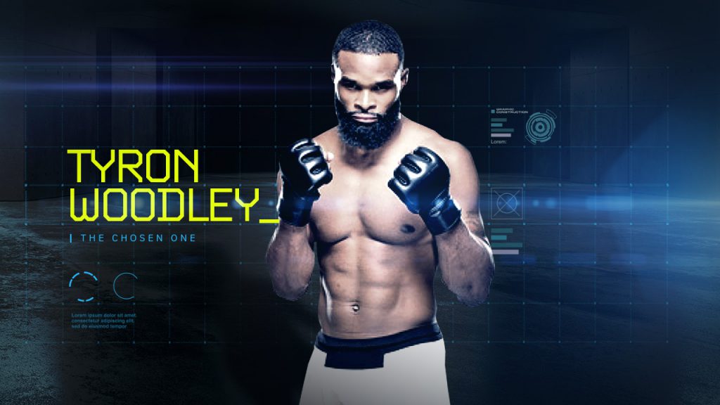
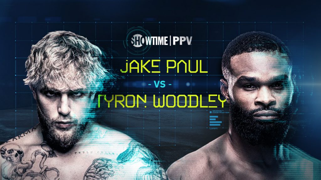
For the Showtime Boxing Paul vs. Woodley promo, a live-action shoot was essential, as no existing fight footage was available. A holographic world concept was developed, immersing both fighters in a high-stakes, fully digital showdown—uploaded for the virtual fight of their lives.
To bring this futuristic environment to life, a blend of tech-inspired design elements was combined with distortion effects and particle dispersions, heightening the intensity of each boxing impact. The result was a visually dynamic promo that captured the energy and spectacle of the matchup.
Concept Design


Style Guide
A holographic color scheme was created to complement the futuristic concept, paired with a digitally distressed geometric typeface for the main messaging and a code-inspired sans-serif for added tech aesthetics.
Joseph also designed custom tech elements, a specialized grid system, and distortion effects—ensuring a cohesive visual language that could be seamlessly integrated throughout the design and compositing process.
#132640
#18668D
#71EDE4
#DBF51C

The Jake Paul vs Woodley promo
Edit and animation by Smith Geiger | Vivid Zero
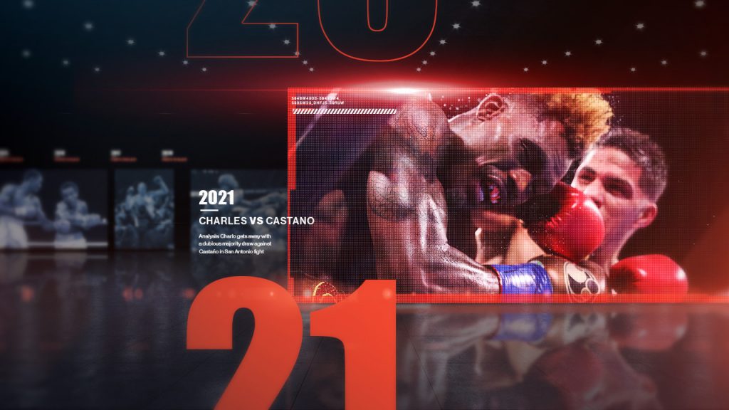
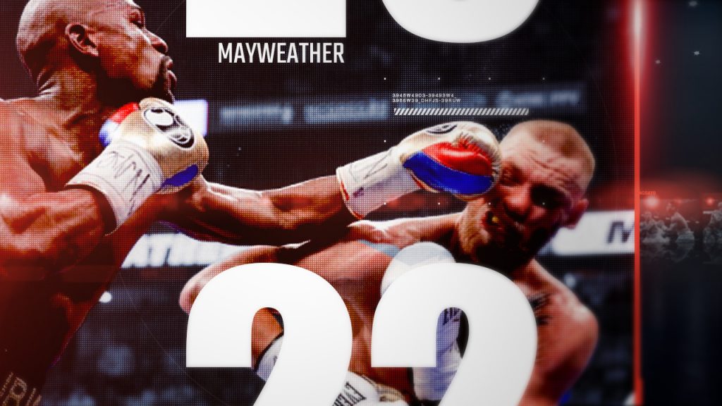
Brand Spot
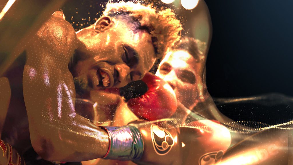
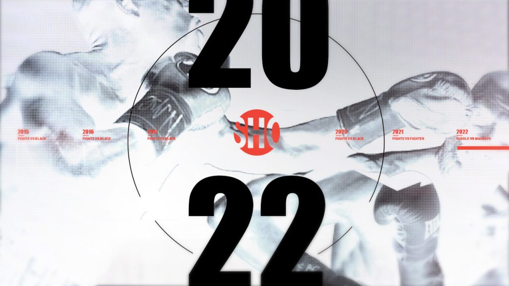
Drawing from Showtime Championship Boxing’s extensive archives, the brand spot takes viewers on a high-energy timeline of the sport’s greatest moments. A dramatic, glossy world of iconic footage, bold typography, and unforgettable fights rushes past the camera, building momentum with each knockout and legendary exchange.
The sequence culminates in a rapid-fire flood of clips, leading to the final countdown—delivering an electrifying finish worthy of the Showtime Championship Boxing legacy.
Promo Design
Promo Design
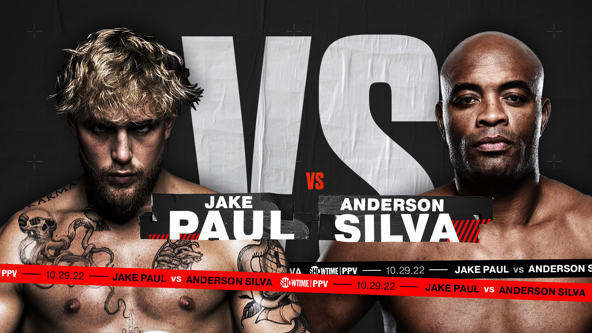
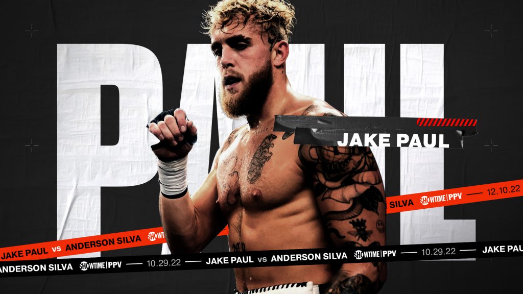
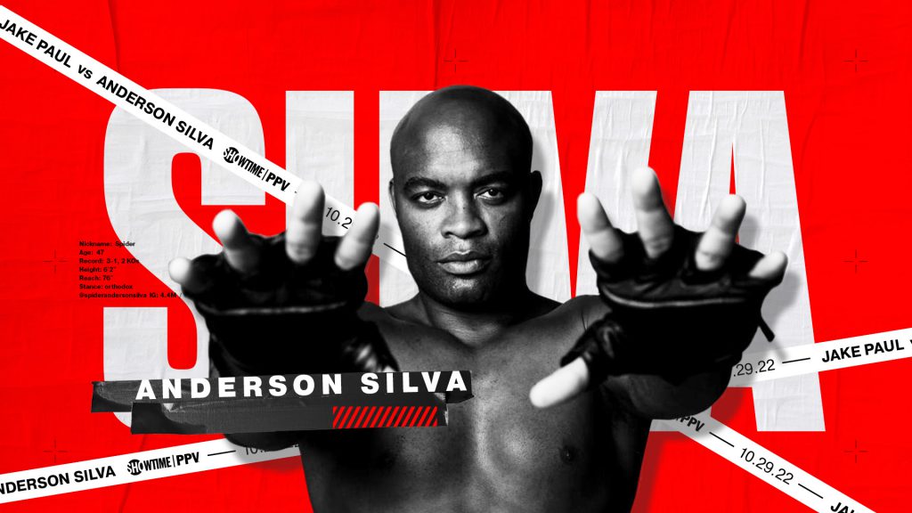
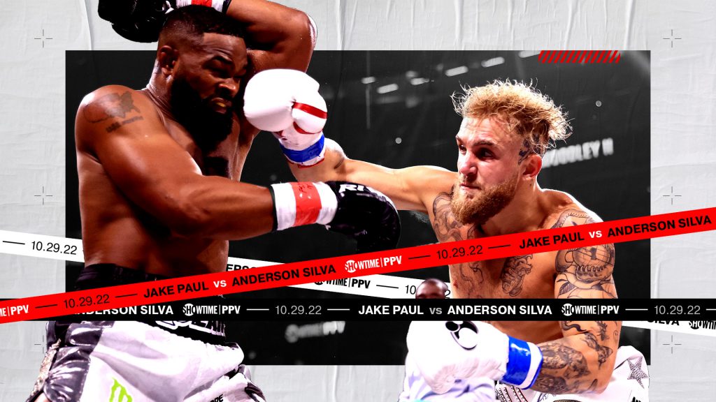
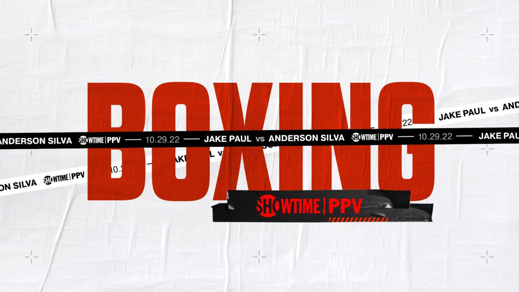
For each matchup, a variety of design directions are explored, providing the client with a wide range of creative approaches to visualize.
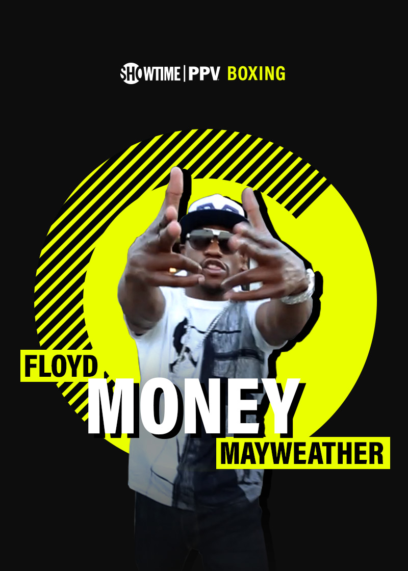
For the Jake Paul vs. Anderson Silva fight, boxing and event tape served as a key design motif. The tape carried typography while seamlessly weaving Showtime’s signature red and black branding throughout the promo.
For the
Promo Design
Related projects
Sport Design