Project Goals
Client:
Agency:



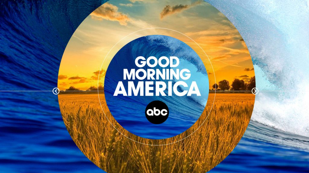

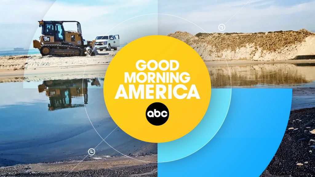


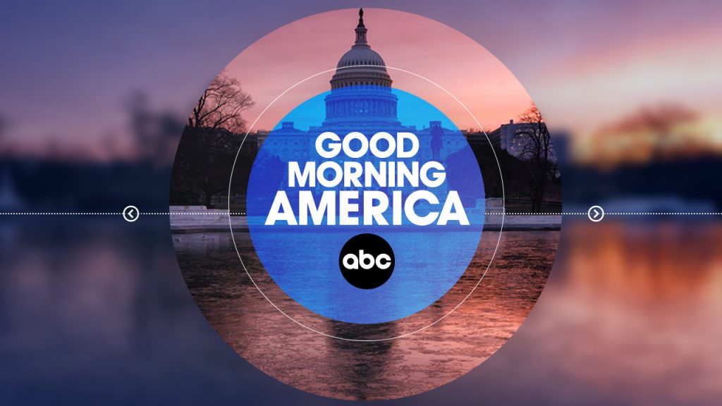
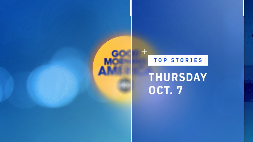
The show open
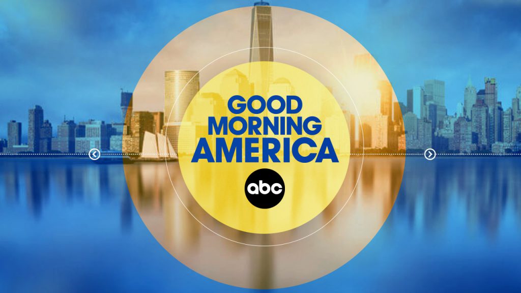
The circular compass expanded into a series of radiating rings, unveiling the day’s top stories each morning. Emanating from its central core, layers of color and imagery overlapped to create a dynamic, visually engaging introduction to the morning news.
Edit and animation by Smith Geiger | Vivid Zero


Style guide
The original Good Morning America brand colors were expanded to be brighter and more inviting, incorporating a fresh light blue and a warm yellow gradient for a more modern, energetic feel.
#0315CE
#006CD1
#59E9FF
#FFDC04
Toolkit design
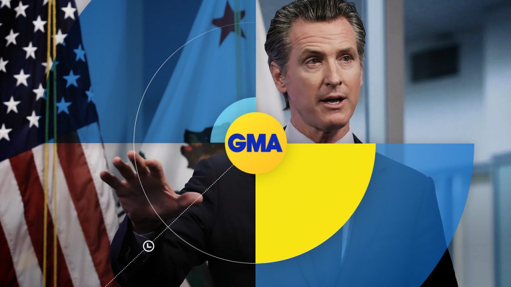
In addition to the show open, cold open, and close, Joseph Kiely designed a suite of template elements for lower-thirds and exclusive stories. Each piece was crafted to work seamlessly together, using the compass motif to guide the viewer’s eye and create a cohesive visual language.




A new vertical cold open
A tech-inspired vertical cold open, or bump-out, was designed to highlight upcoming stories. The stacked content smoothly unfolds before swiping away, mimicking the motion of a smartphone notification for a modern, dynamic feel.